Configurable typography
As well as typeface, other details of typography can make a significant difference to groups under the banner of difficulty reading, particularly where large bodies of text (for example a game description) involved.
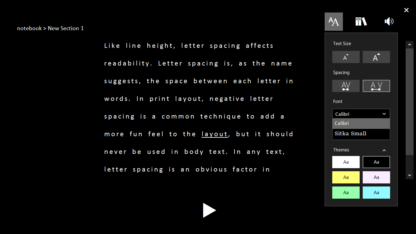
The most important is letter spacing, but also important are mixed case rather than full caps, line spacing, use of bold rather than italics, and left-aligned rather than centred or justified text. If any of these cannot be addressed by default (for example 1.5x line spacing), allow them to be configured.

Configurable letter and line spacing in OneNote Learning Tools
