System font choice
Difficulty reading is a wide umbrella, and within that dyslexia is also a wide umbrella, covering a range of different symptoms and a range of different fixes.
Typography can be a factor, with different typefaces working well for different people. Some have had their lives changed by easy-read typefaces, others need as simple and familiar typeface as possible.
Research into a single helpful solution has therefore understandably been inconclusive. It is most helpful to offer a choice. For example, allow users to choose between an on-brand default, a basic familiar sans serif typeface such as Arial/Verdana, and an easy-read typeface.
Several easy-read typefaces exist, with common themes such as long ascenders and descenders, lack of symmetry between letters, and so on. A particularly notable example is FS-ME, which was developed in conjunction with people with learning difficulties, and has an effective balance of professionally designed type sensibilities and easy-read principles. It was also thoroughly researched and tested by the BBC, resulting in its use as the default font on the YouView set-top box.
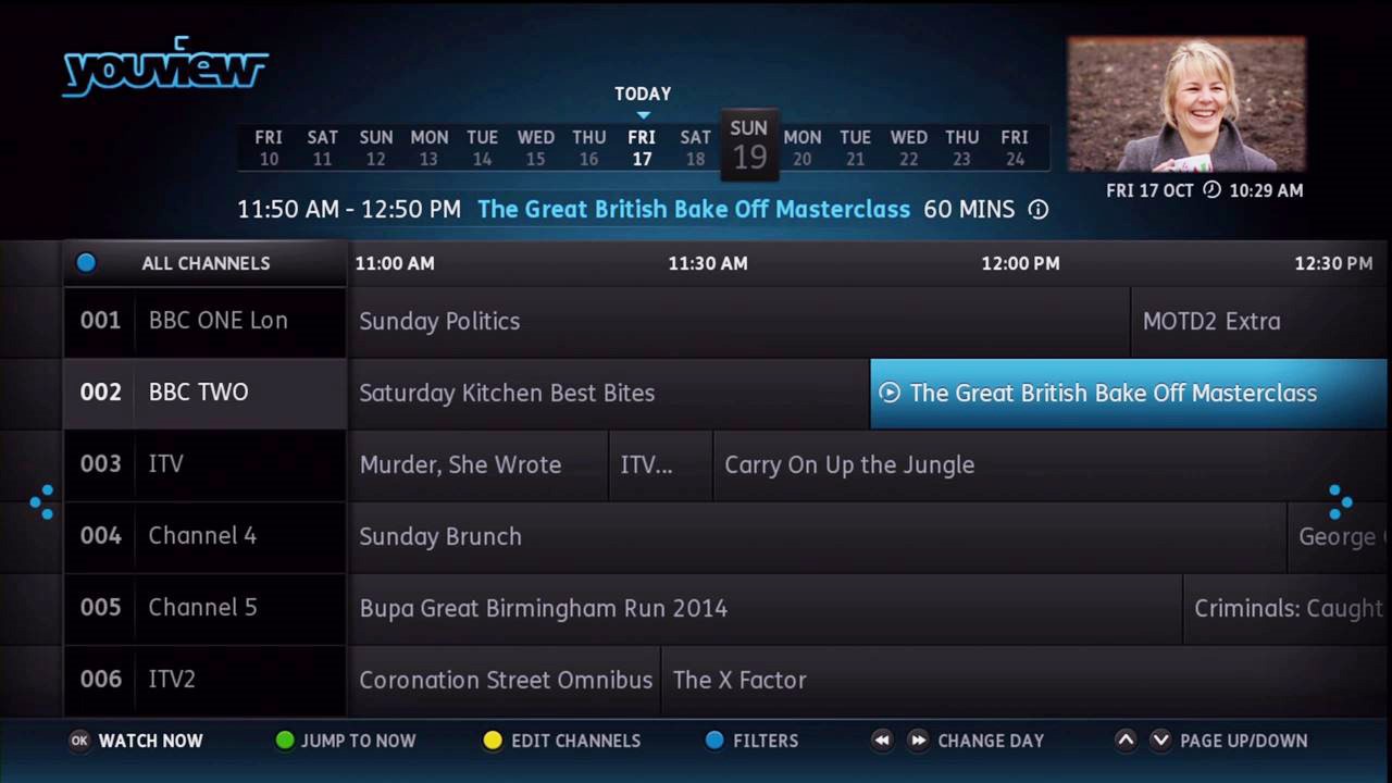
FSME easy-read typeface in use on the YouView set top box
Next: Configurable typography